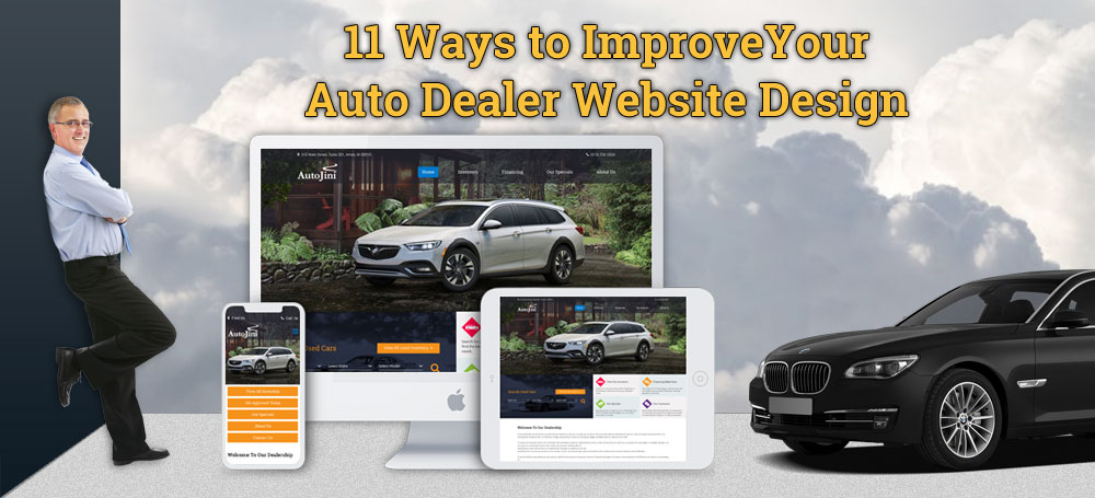
Every good website starts out with a good design, and a good auto sales website design is important for a lot of reasons. Your dealership web design is what’s going to capture your customer’s attention. Aside from having an attractive website, it’s also important to think about your website’s user experience (UX) because once you capture your customer’s attention with your web design, UX is what’s going to keep them on your dealer site.
We have gathered 11 different ways to improve your auto dealer website design for attractiveness, functionality, and UX. Keep reading to learn how to make your dealership web design better.
1. Minimize Animation
Animation can refer to pop-ups, rotating sliders, carousels, moving images, and more. Reducing the amount of animation used on your website is important for several reasons:
- It improves the speed of your website
- Users prefer a website experience without too much distraction
- Sometimes, animation won’t display properly, so that entire section will be blank instead which means your customer may be missing out on important information
- Text on a moving slider is often not recognized by Google as content, and therefore it damages your Search Engine Optimization (SEO)
2. Implement a User-Friendly Navigation Bar
Too many websites have a navigation bar that is far too complicated to use. There are even websites that don’t have a navigation bar at all. Make it easier for your customers to find your pages and improve your web design with a navigation bar at the top of your website that goes across horizontally and is present on every page.
3. Showcase Your Inventory
At AutoJini, we’ve noticed that there are a lot of dealer websites that don’t showcase their inventory, or the system of showcasing their cars is unorganized and difficult for customers to view. When you showcase your inventory on your dealer website, your dealership is basically open 24/7 online. Customers can browse and view your vehicles whenever they want, even when your dealership is closed.
4. Only Use Hi-Resolution Images
Poor images or low-quality pictures hurt your website more than you think. They don’t look professional, and they also make your customers lose trust in your dealership. Always use high-quality images on your website. If you can’t afford a professional photographer, here is a guide on how to take photos for your car dealership.
5. Use Pictures of People
Study after study has shown that users are more responsive to pictures of faces than they are to pictures of objects or scenery. This doesn’t mean that you should fill your web pages with stock photos of people, but it does mean that you should try to get pictures of your employees and customers when you can.
6. Implement a Responsive Layout
A responsive website will ensure the following:
- A mobile-friendly website
- All images, text, and content will automatically adjust to fit any screen size
- Consistency across all devices
- Faster loading speed
- Improved UX
- And much more!
Google recommends all websites to have a responsive layout because it improves the experience for all users.
7. Use a Call-to-Action on Each Page
Each page should include a clear call to action. This can be done with a Contact Us button, a call extension, or text that tells the customer what to do such as, “Call us today at (XXX) XXX-XXXX.” Even if your page is laid out nicely and looks attractive, users often don’t know what to do next or exit a page if they aren’t directed to an action.
8. Have Your Phone Number & Address Clearly Visible
This goes back to our previous point about using a call to action on every page. Your phone number and address should be in the header section and/or the footer section of your website and visible on every page. To take it to the next level, have your phone number link to a call extension, and have your address link to your location on Google Maps.
9. Don’t Clutter Your Pages
A professional, user-friendly website should be simple and clean. When you clutter your auto sales site with too much content, pictures, or inventory, you end up driving customers away and causing your website to load slower. Users want a website that is easy to use without too many distractions. When a website or its pages is cluttered with content, users often get frustrated and just exit the site immediately. Separate your content into different sections and pages, and don’t stuff your pages with unnecessary information or pictures.
10. Keep Your Website Design Consistent Across All Pages
Find a design, layout, or color theme that you like and keep it consistent throughout your entire dealership website. Many people become too eager to create intricate designs for each page, which will only confuse users who have a short attention span and memory. By keeping your pages consistent, your customers will remember your dealership brand better, even if they exit your website and decide to visit again later.
11. Include Social Media Buttons
Be sure to add buttons that link to your dealership’s Facebook, Twitter, and Instagram pages. The best places to put these buttons are in the header section of your website or at the bottom of each page. This adds a bit to the white space in these sections, and it also shows your customers that you want to connect with them. It’s also a great way to build followers for your social media pages.
AutoJini’s graphic design and marketing specialists team not only creates beautiful websites, but we focus specifically on websites for auto dealers. Our expertise and passion will get you where you need to be. Call us today at 515-232-2024 to talk about your website design, or contact us by clicking on the button below!

