The pictures you use online and in social media can do more than add visual interest or catch someone’s attention, they can create a call to action (CTA). Before including any image in your post, think about what you want to drive your customers to do. For dealerships, the CTA might be to schedule a test drive, apply for financing, take advantage of a special offer, or request more information.
To direct your audience, your images need to have two components:
- An attractive image that is scaled properly
- A simple, but eye-catching Call to Action
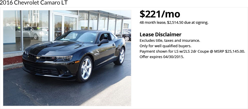
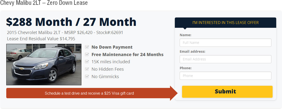
In Figure 1 below, we have a basic post with an image of a Camaro. It’s not that Figure 1 doesn’t have a CTA; it does (in the form of “Contact us for more information”). In Figure 2 we have the same basic information plus three distinct calls to action at the bottom (Apply for Financing, Schedule Test Drive, Request More Info). Figure 2 is an image that we here at AutoJini.com created for one of our lease sites and is a more straight-forward and effective example of creating a call to action. As you can see, it doesn’t take much to make a CTA stand out–a bit of color blocking, and simple, easy-to-read placement of the text was all we needed.
2016 Chevrolet Camaro LT. Zero Down (tax include). $479/mo. 42 Month Lease, MSRP #37,340. Contact us for more information.


CTAs can be subtle or straight-forward. Companies such as Volkswagen have been known for the effectiveness of their ads even though those ads have been quite subtle and simple. In fact, simplicity is often the key to effectively delivering your message. Remember, not every image needs to have a CTA. If every image you post has a CTA, then you start to appear repetitive. You’re better off maintaining a consistency in your message than forcing a CTA into every image. And when you do create a CTA, try some that are subtle and others that are straight-forward to see what works best for your dealership.

